Nature and the human desire to manipulate it's beauty come together in this video feature. Meditate on this for a while...
Saturday, April 30, 2011
Saturday, April 23, 2011
Book Feature - Close: Landscape Design and Land Art in Scotland
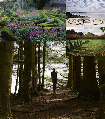
Eye candy and imagination. This book features the magical landscape photography of Allan Pollok-Morris. Search the web for more imagery by the photographer.
See www.northfieldeditions.com for more info on the book.
Saturday, April 16, 2011
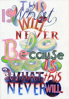
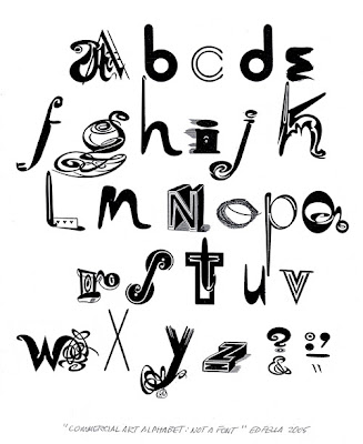
Featured Designer: Graphic Designer Ed Fella
The King of Zing. An old-school designer with a flare for text and hand drawn lettering, Ed Fella often uses the four colour ball point pen to illustrate his ideas. Check out the documentary for an in depth look at his anti-computer approach. He truly stands out in our techno-dependant world. Note the small print on image 2. Click to enlarge.


Labels:
Ed Fella,
Graphic Design,
Graphic Designer
Saturday, April 9, 2011
Artificial Leaf Turns Sunlight into Electric Power
A new breakthrough uses biomimicry to solve the energy crisis. Attention all investors! Amazing stuff. Watch this short clip.
http://www.voanews.com/english/news/environment/Artificial-Leaf-Turns-Sunlight-into-Electric-Power-119070894.html
http://www.voanews.com/english/news/environment/Artificial-Leaf-Turns-Sunlight-into-Electric-Power-119070894.html
Labels:
Artificial Leaf,
Biomimicry,
Energy
Sunday, April 3, 2011
Book Feature: Google Sketchup for Site Design by Daniel Tal
This Book is a great reference tool for any intermediate or advanced Sketchup user. Check out this video for a Sketchup tour and a visual guide through the book's table of contents.
Saturday, April 2, 2011
Autodesk Sketchbook Pro in Action
Here is a great example of the power and fun Autodesk Sketchbook Pro can bring to the creative user.
Labels:
Autodesk Sketchbook Pro,
You Tube
Friday, April 1, 2011
Making Old-School New: Multi-Media Hand Drawn Landscape Designs
This posting is to introduce a multi-media approach to the old school hand drawn landscape plan. With some experimentation, I have developed a simple process to present clean and crisp hand drawn landscape plans, while still integrating Photoshop text, colour & imagery.
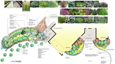
Overall, I think the multi-media approach for this simple landscape concept, although had many stages to achieve the final result, was worth the effort. Once familiar with the techniques, it becomes a lot simpler to bounce back and forth between the various forms of software and achieve a clean professional drawing.
IMAGE 1 - This is a portion of the survey done for the project. Note the simplicity that one can use to record the existing site data. Despite the simplicity, always double check measurements and be sure you can read your notes. These survey notes are typically for the Designers eyes only.
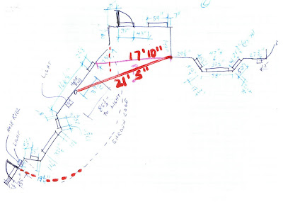
IMAGE 2 - This represents the "Cadification" (my own technical term) - a.k.a. the autocad drafted baseplan created using the above survey notes. This was then printed on a translucent mylar sheet. The drawing size was planned out to allow for a 24"x36" presentation at 1/4"=1'-0" scale.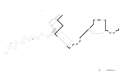

IMAGE 2 - This represents the "Cadification" (my own technical term) - a.k.a. the autocad drafted baseplan created using the above survey notes. This was then printed on a translucent mylar sheet. The drawing size was planned out to allow for a 24"x36" presentation at 1/4"=1'-0" scale.

IMAGE 3 - This is the mylar sheet with the concept rendering directly on the mylar. To achieve this, I overlaid trace paper and worked out my concept roughly with markers. Then proceeded to trace directly on the translucent mylar using hand sketching techniques. This step involved trace then trace again. The image is then scanned. As you can see, the image is still rough: note the colour testing in the top corner as well as the faded and lackluster colour provided by the scanning process.
IMAGE 4 - To achieve this final glossy cleaned up image, there were several important steps performed. First - the mylar scan is cleaned up using Photoshop. The colour is brightened and the contrast is enhanced. It is then brought into Autodesk Sketchbook Pro. I decided to clean up some of the line work to darken it as well as give it a crisp look. This was done mostly by tracing in a black overlay using my recently purchased and previously enjoyed Wacom tablet. The image is then brought back into Photoshop where text, colour, images and a title heading was added (removed from this image for client privacy). The final step was to overlay my original cad drawing (Printed as PDF) on top of the sketchwork using Photoshop . This provided the dark black line work that ultimately superseded the faded scanned line work.

Overall, I think the multi-media approach for this simple landscape concept, although had many stages to achieve the final result, was worth the effort. Once familiar with the techniques, it becomes a lot simpler to bounce back and forth between the various forms of software and achieve a clean professional drawing.
Visit http://www.draftroots.com/ for more imagery.
Subscribe to:
Comments (Atom)

